A significant design challenge was maintaining consistency with the established branding guidelines of the main Zuzu app while simultaneously ensuring a professional and credible tone suitable for our target audience of teachers, typically aged 25 and above. The delicate balance involved avoiding an overly child-friendly aesthetic, which might detract from the app's professional intent, while still aligning with the playful and engaging essence of the overall Zuzu brand identity.
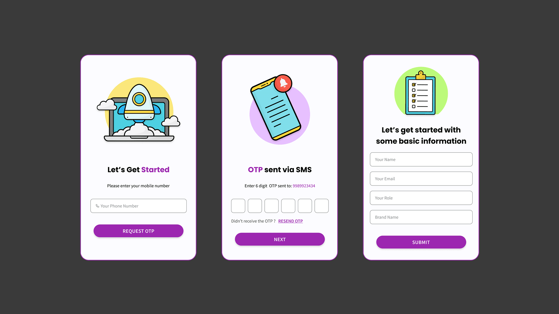
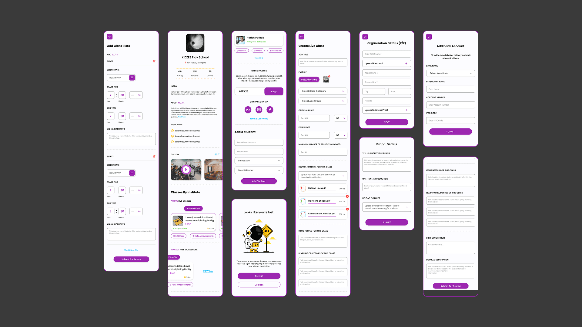
Onboarding Screens: Our vision for the Partner App's onboarding process was rooted in efficiency and user-friendliness. We designed a streamlined 3-step onboarding flow, strategically shortening the form-filling steps to prioritize ease and convenience. This simplified approach ensured a seamless and quick sign-up experience for teachers, enabling them to get started with minimal friction.
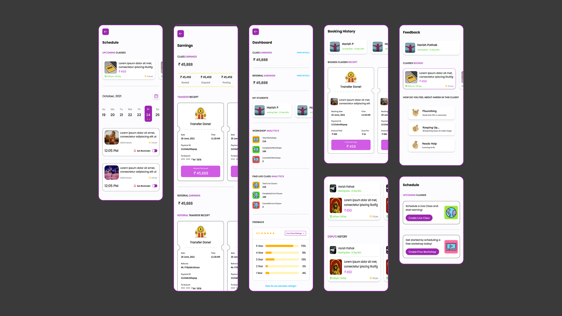
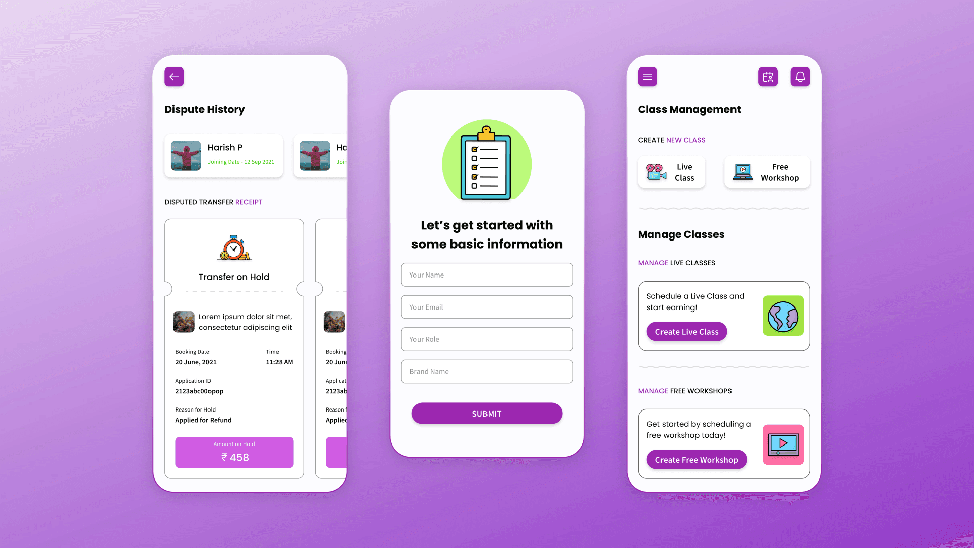
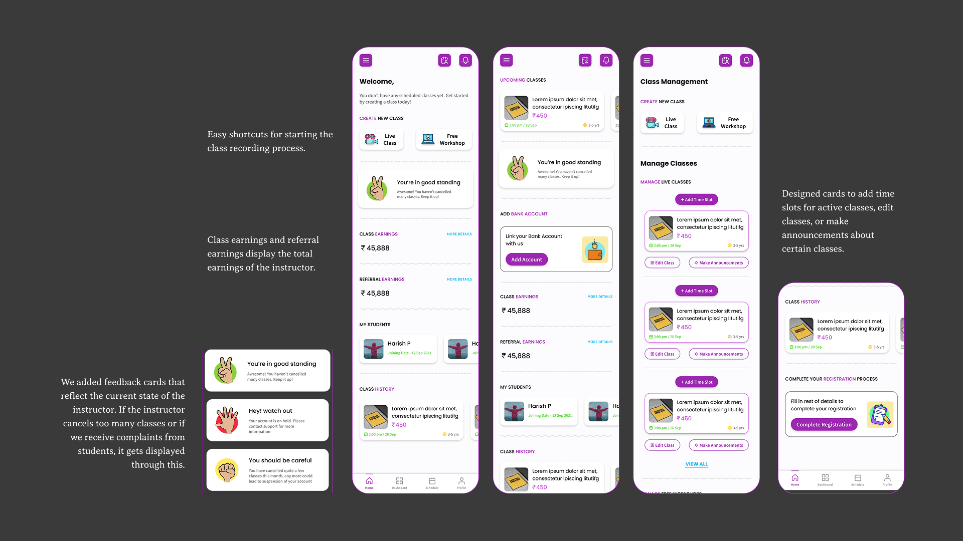
The homepage was meticulously designed to serve as a central hub for all essential teacher functionalities. It provided immediate access to critical features such as class creation, feedback submission, earnings tracking, and comprehensive lists of students and classes. A dedicated class management screen was integrated, allowing teachers to effortlessly handle all their active classes and add new ones, ensuring that every necessary tool was readily available from a single, intuitive interface.
The dashboard screen was developed to empower teachers with effortless management of their students and earnings. It prominently displayed total earnings, the number of active students, and key analytics, offering teachers a quick and insightful overview of their performance. To further enhance class management, we incorporated intuitive schedule screens, enabling teachers to easily monitor and plan their routines. In line with the Zuzu brand guidelines, payment receipts were designed to resemble engaging, real-world tickets, and feedback icons were consistently applied to maintain brand cohesion and user engagement.
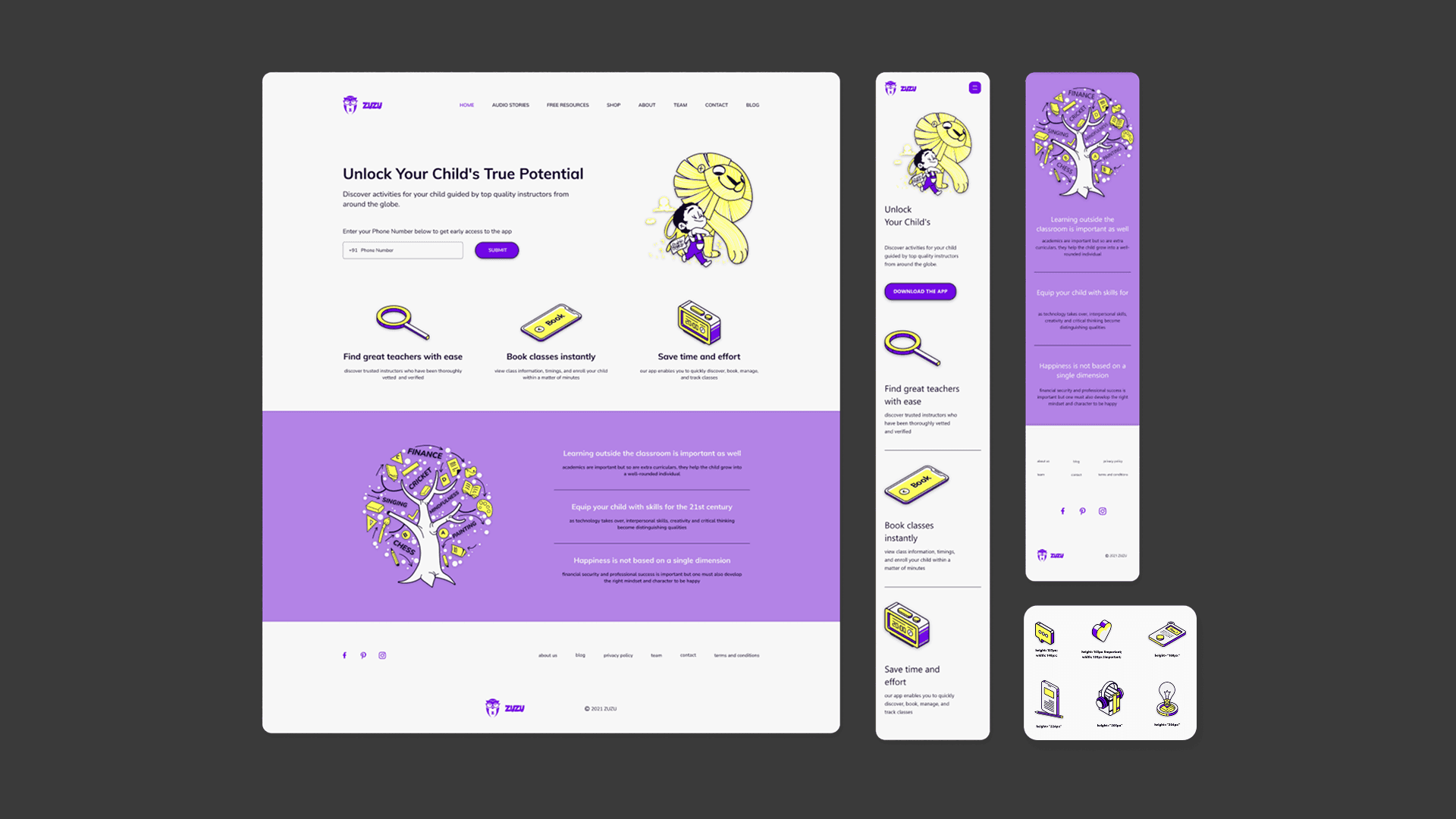
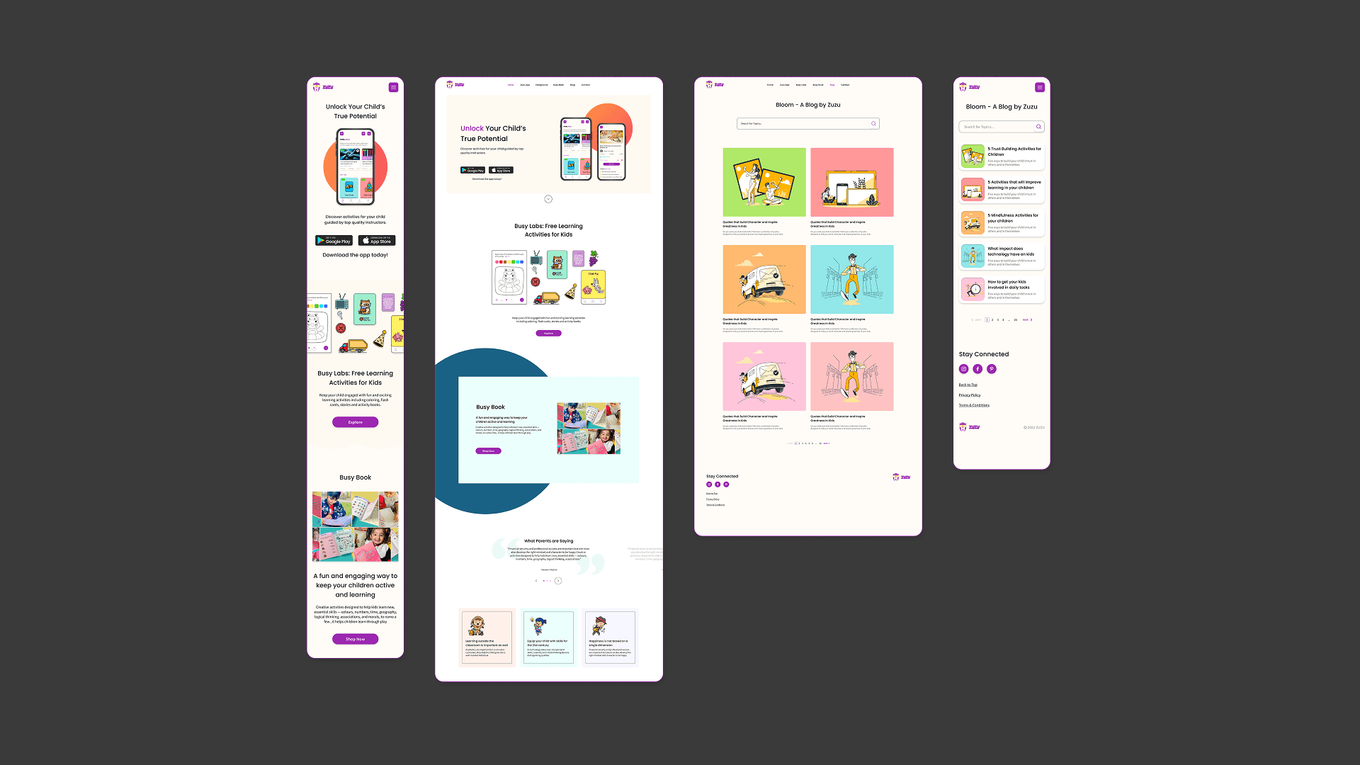
Project Goal: The primary objective behind the introduction of the Zuzu Website was to serve as a comprehensive informational portal for Zuzu, showcasing its mobile application and other product offerings. Following the successful launch of the Zuzu app, we observed a user behavior trend where parents preferred utilizing the website for payment transactions, while the app remained their primary platform for content consumption and video access. This insight led to a strategic pivot, prompting us to integrate robust payment gateways into the website and significantly expand its online content, including the addition of engaging educational games.
Version 1: Establishing Brand Consistency and User EngagementIn the initial design phase of the Zuzu website, my focus was on maintaining strict adherence to the established branding guidelines of the Zuzu app. This involved ensuring consistent typography and color palettes across the entire website. I meticulously crafted custom illustrations that not only captured the essence of our educational content but also seamlessly integrated the brand colors, creating a visually cohesive and appealing experience.
To enhance user acquisition and boost app downloads, we introduced a mobile number input form, providing users with a convenient and direct method to receive the app download link on their phones. Complementing this, I incorporated informative illustrations that highlighted the numerous benefits of using the Zuzu app and underscored the importance of holistic learning for children. The aim was to create a website that was not only informative but also visually engaging and inspiring for visitors.
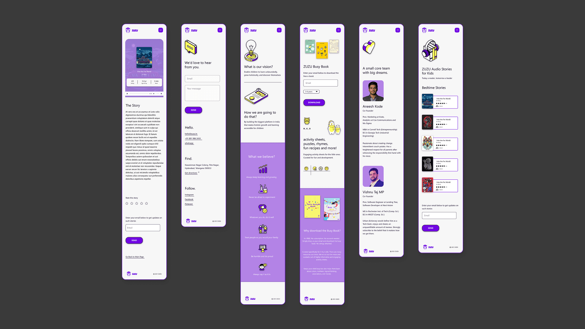
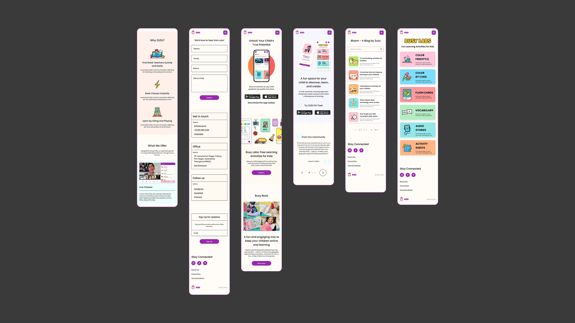
We developed a diverse range of screens for Zuzu's website, ensuring a seamless and intuitive user experience. These included dedicated pages for audio stories, various content categories and sub-categories.
"About Us" section, a team page, a contact page, and a special area for kids to explore and download activity books. For each of these sections, I designed consistent illustrations, conducting detailed research to identify the key aspects that should be highlighted. This meticulous approach was crucial as the founding members aimed to maintain a tight and minimalistic design for the website. The goal was to provide essential information while keeping the user interface clean and user-friendly.
For Zuzu’s website Version 2, we embarked on a comprehensive research phase encompassing both design and content strategies. I delved into various articles and resources on effective marketing website design to glean best practices and innovative ideas. This research informed key design decisions, such as the strategic placement of clear Calls to Action (CTAs) within each screen section and the meticulous crafting of explanations detailing Zuzu’s unique offerings. Furthermore, I prioritized the integration of authentic product imagery to enhance the website’s credibility and foster a genuine connection with our audience.
A significant visual transformation in Version 2 involved a deliberate shift in the color palette. I transitioned from the previous purple and yellow theme to a more contemporary and inviting scheme of softer pastel colors, artfully mixed to create a playful yet sophisticated aesthetic. This not only contributed to a more enjoyable visual experience but also introduced a dynamic variety across different sections of the website, further enhancing user engagement and brand appeal.